Project Reveal: Modern Haven Remodel Pt.2
Kitchen
It’s been a while since we wrapped up this project and although we’ve shared a few images from these spaces over this past year, we haven’t taken you through a deeper dive into the process and decisions behind the designs. We’re excited to re-visit the Kitchen and Kitchen Nook that sits at the heart of our Modern Haven Remodel. This space started out with dated finishes, dark colors and cabinetry that didn’t function for our clients.
Before
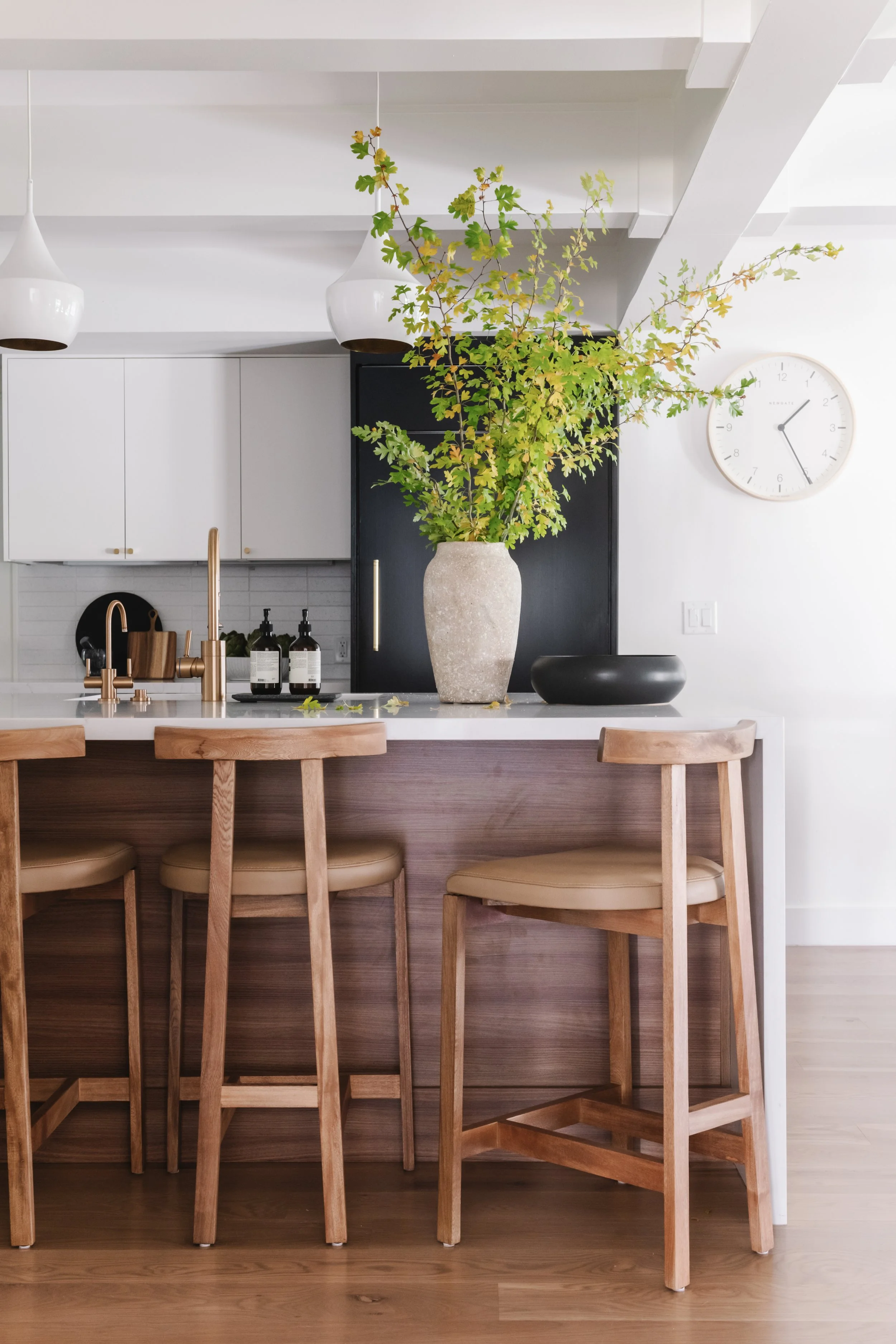
The general footprint of the kitchen remained the same while the finish work and fixtures were replaced to make a complete 180 into a design that aligned with our client’s personal taste. There is only one direct source of light into this space so we wanted to make sure we made it feel brighter by using white paint and on the walls, ceiling and the upper parts of the cabinetry and hood. We love how light and fresh the white paint made the space feel but we wanted a little more interest in the space and added more depth by painting the lower cabinets a dark, almost black/blue color. The dark and light achieved a beautiful contrast but we took it one step further making the island a darker walnut wood finish for added warmth, breaking up those cooler tones. There is just enough of each color represented in the space that they don’t overpower each other while working together to complete the design. We added brass accents through the plumbing and hardware for more bright contrast while the flat cabinetry and horizontal stack backsplash helps the space lean more into a modern design.
After
Desk Nook
Because we kept the existing footprint, an open area already sat here in the original layout. We love bringing function to a kitchen in more ways than one and our client loved the idea of keeping this an area where their kids could sit and do their homework during dinner prep while also serving as additional kitchen storage. This nook provided the opportunity to blend function and beauty together while creating a unique space for every family member to utilize. We incorporated the same kitchen finishes continuing the horizontal tile backsplash behind the open shelves that match the island finish.
Modern Haven Paint
Walls | Cabinets | Ceiling
Sherwin Williams - Alabaster
Cabinets | Nook Drawers
Inkwell - Sherwin Williams
Kitchen Nook
This area sits right off of the kitchen and provides a more casual dining experience than their formal dining room that sits off their entry. Keeping with the same footprint of the home allowed us to create these beautiful built-ins that flanked what once was a plain, open wall. Adding the brass sconce highlights a beautiful abstract piece that softens the bold dark blue drawers and black modern fixture above the table. We continued the open shelves of the homework nook above the storage drawers to showcase our clients personal pieces and extra dish ware.
Check out Part One of the Modern Haven Remodel here and stay tuned for Part Three in the coming weeks!


